Interactive Example
Rules of Thumb
- Use Toasts when the system needs to provide feedback about a user action or system status.
- Toasts should only be used for simple notifications, confirmations, and low-priority alerts.
- Toast messages should contain no more than one to two lines of text.
- Don’t change the background color of a Toast; it should be unobtrusive.
Appearance and Behavior
Toast notifications attract a user’s attention without forcing the user to interact with the message as they can dismiss on a timer. Toast messages solve the problem of users needing a less critical type of message notification than a notification banner, badge, or modal. This offers users more flexibility for displaying different kinds of messages that may need attention related to system or user feedback.
Toasts consist of a simple rectangular pop up and a message. Alternatively, toasts may also contain icons, such as a close button for non-dismissible toasts, and links. Toasts can auto-dismiss after displaying for a brief time on the screen.
Placement
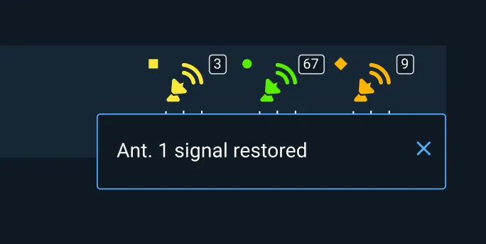
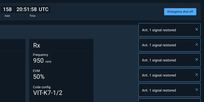
Toasts typically slide in and out of the top right side of the desktop screen and should be displayed below Monitoring Icons if those are being used in the status bar. Toasts can also be displayed at the bottom (left or right) or top center of the desktop screen.
Dismissible Toast
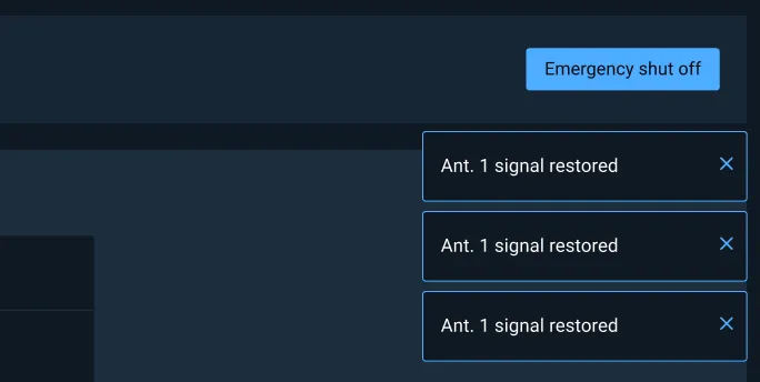
A Dismissible Toast is a type of toast message with actionable content which persists until an action is taken or it is dismissed by the user.
Toast Stack
The Toast Stack is a group of toasts displayed in a vertical arrangement. New toast notifications appear at the top of the Toast Stack and push older stacks down.
Examples


Asset Status
| Asset | Version | Status |
|---|---|---|
| Documentation | N/A | Available |
| UI Kit - Dark | v7 | Available |
| UI Kit - Light | v7 | Available |
| UI Kit - Wireframe | v7 | Available |
| Web Component | v7 | In Progress |
| Component Tokens | N/A | Planned |